Friday 26 November 2010

Zine DPS


Zine DPS Content

I used some information about zines from http://www.undergroundpress.org/faq/, the information I used takes up the majority the first page, I have also edited it slightly to be more appropriate. The second page I wrote myself using the knowledge I gained through research. I found some images to match the text http://900bats.com/2010/how-to-make-a-zine/http://wemakezines.ning.com/photo/my-stall-at-footprint-zine?context=latesthttp://www.brightonzinefest.co.uk/communities/5/004/006/764/245/images/4527863483.jpghttp://www.yearofscience2009.org/about/WaterBears.jpg. I also used coffee stain rings to decorate the DPS as they provide colour and are appropriate as many people would drink coffee whilst reading zines and possibly use them as coasters! http://www.conamericas.com/images/Coffee%20Photo_Cup%20Stain_Leave%20your%20mark_Drink%20our%20coffee%20(2).jpg

Title: What are Zines?

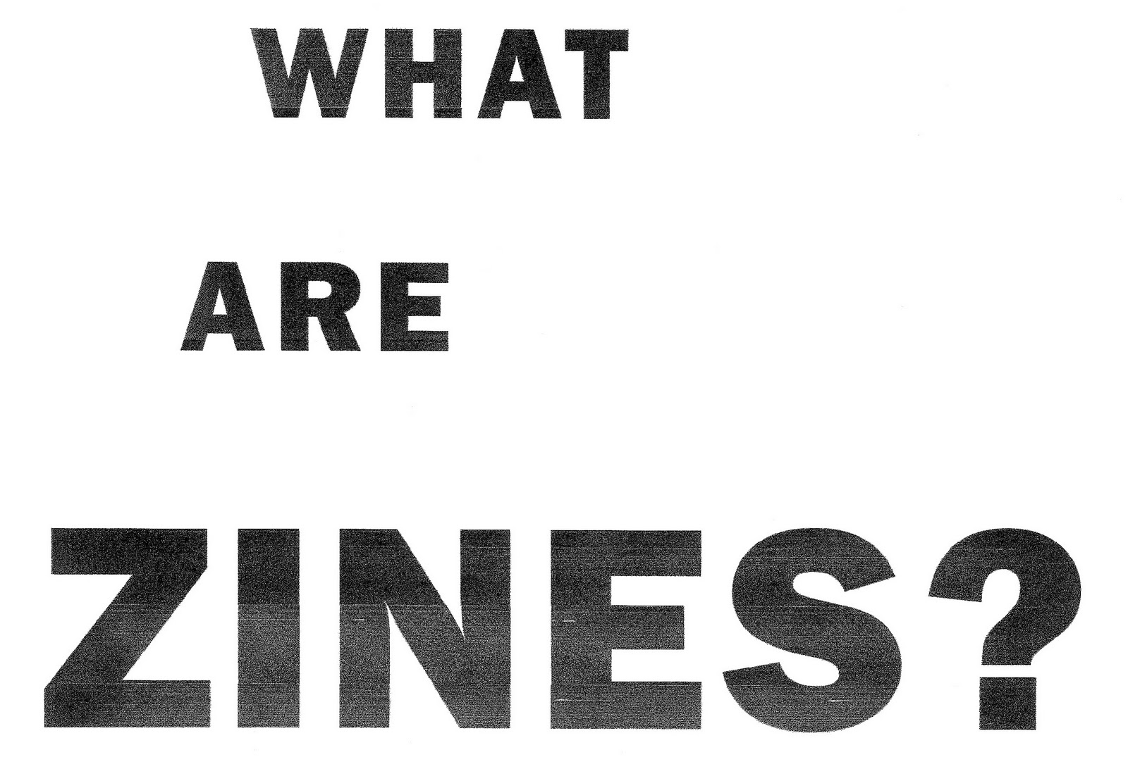
I chose the title "What are zine?" as it is very obvious and to the point. Before creating my DPS I first felt it important to create an eye catching, artistic title. As zines are photocopied I wanted to give the title a photocopied effect, first I chose a font which looks similar to that of what is used in zines and draft printed it to get a texture, scanned it in and increased the black levels to restore contrast lost in printing.

Looking at it I thought the texture was too subtle and I didn't feel it was creative or reflective enough of zines.
I researched zines some more and it occurred to me that most people hand draw using fine liners.
I traced the text wit a fine liner and filled it in in a diagonal fashion.
I much prefer the second result and feel like it represents zines much better.

Grid system

To choose a suitable grid system I first read up on how they are used by downloading the PDF's provided on blackboard and by looking at the recommended websites. I chose a grid provided on http://www.thegridsystem.org it is a 6x6 cell A4 grid. I believe it looks very versatile and will provide enough placement to be creative.

Zines

Knowing nothing about zines myself I needed to research them in order to produce a DPS. I started with the internet using reputable sources I found out a lot of useful information. I also went to Manchester's Northern Quarter to find some zines in order to understand their purpose and content, I went to the book shop Magma where I found one zine, they had more zines in earlier during the week but all had been taken. The zine I found was called Artical and is produced by a team in Sheffield and distributes 4000 copies nationwide. In the zine I read many though provoking, entertaining and interesting articals; I felt the style of writing to be informal and honest which is very refreshing to the edited and monitored articals in popular magaines.

Saturday 20 November 2010

Photo-manipulation

I've always appreciated photo-manipulation as an art form, as it incorporates photography and graphic design a very high skill level is required to produce even a decent result. I've selected a few examples of what I consider to be amazing artworks below, these are the sort of example I want to show in my double page spread.
http://media.smashingmagazine.com/cdn_noupe/img/photomanip-26.jpg
http://www.behance.net/Gallery/mio-gps/113621
http://adsoftheworld.com/files/images/Perrier_Boite_4x3.jpg
http://fc03.deviantart.net/fs40/f/2009/034/5/8/5853c18300d63c3d4ea4f356a1c59e03.jpg
http://fc09.deviantart.net/fs48/f/2009/222/6/c/global_warming_PSA___time_by_pepey.jpg


Friday 19 November 2010

Superdry


I tend to wear Superdry on a daily basis as it it one of my favourite brands. Although their prices are quite high the quality of their clothes is very high (apart from the most recent t-shirt I bought which has aged more than my oldest one!) The brand itself is british but combines American style fashion with Japanese text, people often believe it is a Japanese brand. The brand started in 2003 and became well known after David Beckham was spotted wearing their clothes. The popularity of Superdry has increased dramatically in the past couple of years (I've noticed far more people wearing it than even one year ago). The styles they offer do not vary much, they provide a lot of colours though. But mainly the choice behind Superdry is the quality and fashionability.

Double Page Spreads and Advert

I am going to produce two double page spreads: one about Zines and one about photomanipulation. I am also creating an advert for Superdry.

Wednesday 17 November 2010

Final Illustration

I used various parts of different photos I took and applied them to selections of the illustration to give it colour and texture.

Digital Illustration


I digitally traced my pencil illustration using illustrator so the lines would be more refined and so it could be edited.

Pencil Illustration

I liked the idea of illustrations that look like they're coming out of the page so I decided to try and draw a few sketches of mediacityuk coming out of a tv screen. Using photos from my visit as a reference I came up with tthis illustration.

Tuesday 9 November 2010

UK Illustrator: Mike Harrison


Mike Harrison is a 25 year old freelance graphic designer and illustrator. He has 7 years of experience in the graphic design industry. I really like this illustration of his called "Blackhole", i really like the contrast of the white horse and detailed line art against the black background, i also really like the subtle inclusion of blue colour. I like the perspective and how it makes it look almost as if it is coming out of the page

KittoZutto


KittoZutto is an art and design boutique comprising of Yana & Jun.
They combine fine art illustration with digital imaging, and the highly-detailed results are often best seen in large formats.

There isn't much information about them on the internet but I was drawn to this image because I really like the glow of the wheat, the contrast of the birds on the black background and the interesting wooden texture of the background.

Alberto Cerriteño


Alberto Cerriteño is a Mexican illustrator & designer. He is strongly inspired by urban vinyl toys, alternative cartoons, and the pop surrealism movement.
 I like his use of strong textures, rich colours and the use of basic shapes to create characters. 

Monday 8 November 2010

MediaCityUK: Facts and Figures


MediaCityUK will be connected to one of the most advanced communications networks in the world, they are installing more than 20 million metres of fibre optic data cable (enough to stretch from Salford to Sydney, Australia). The network will be able to handle speeds of up to 10 gigabits a second..


There will be two brand new 22 storey residential towers: TheHeart and NumberOne. Both the towers overlook the plaza and are adjacent to the BBC. Residents will benefit from transport links such as: a tram terminal, a new link road to the M602 and around 300 cycle bays across MediaCityUK.


The University of Salford has already committed to an on-site presence at MediaCityUK, and will occupy a new research and technology facility from 2011.  An estimated 1,500 students will be based on the campus.


MediaCityUK aspire to have the highest environmental and energy saving ratings. The are the first development to become a BREEAM approved sustainable community.


MediaCityUK will be served by a trigeneration power plant, which will help minimise CO2 emissions by centralising heating and cooling equipment. This process will also utilise water from the Manchester Ship Canal, before returning it cleaner than before

MediaCityUK

This is an overhead plan of what is to be expected to be built at MediaCityUK by 2011 (Phase 1).
As you can see from the key in the plan MediaCityUK is aiming to be a fully functional city providing services for all aspects of life such as appartements, university, jobs, hotels etc.
I feel that is is important to communicate that it will be an actual "City" in the illustration as I believe many people are only aware that it will house a new site for the BBC.