The first thing that came to mind when I thought of photo manipulation was Photoshop so I wanted to create a Photoshop themed title for my DPS. I considered using bounding boxes, icons such as clonestamp etc. and then I realised that Photoshop's icon itself would be recognisable enough.
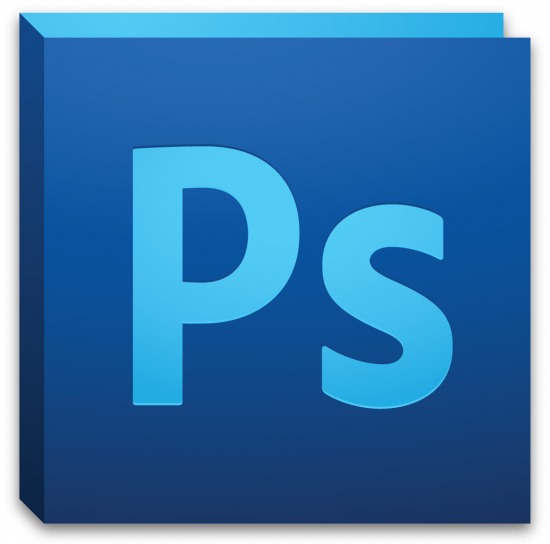 |
| Photoshop CS5 |
So I started to create my own version.
By using the original logo as a reference for design and colour it was relatively easy to emulate the style.
 |
| The front panel uses a dark blue gradient |
 |
| The side panel uses a darker blue gradient |
 |
| The back panel is a solid light blue |
 |
| The font used in the original is called Adobe Clean but it is limited for use by the Adobe Corporation only so I used a very similar font called Myriad Pro Semibold. The text uses a light blue gradient and a slight vertical bevel and emboss. |
 |
| Here is my final logo with a slight drop shadow like the original. |


