This is the superdry advert I have designed. All of the photographs were taken by me of my clothes. I wanted to capture all the interesing textures, colours and designs superdry have to offer.
Thursday, 2 December 2010
Superdry Advert
This is the superdry advert I have designed. All of the photographs were taken by me of my clothes. I wanted to capture all the interesing textures, colours and designs superdry have to offer.
Wednesday, 1 December 2010
Photo-manipulation DPS
For my DPS on Photo Manipulation I experimented with creating my own grids and settled on using a 4x4 grid as this gave me enough versatility to use horizontal and vertical orientated images.
The first block of text was copied from http://www.litconline.com/arts-and-artists/the-art-of-photo-manipulation/ and the rest of the text I wrote myself.
Photo-manipulation Title
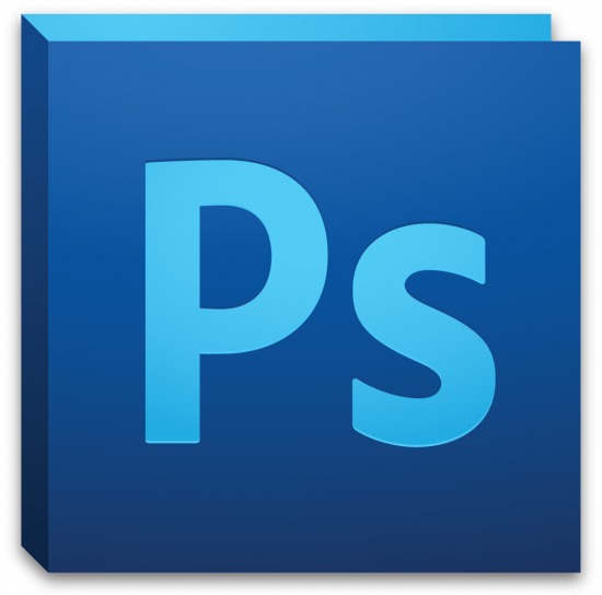
The first thing that came to mind when I thought of photo manipulation was Photoshop so I wanted to create a Photoshop themed title for my DPS. I considered using bounding boxes, icons such as clonestamp etc. and then I realised that Photoshop's icon itself would be recognisable enough.
 |
| Photoshop CS5 |
So I started to create my own version.
By using the original logo as a reference for design and colour it was relatively easy to emulate the style.
 |
| The front panel uses a dark blue gradient |
 |
| The side panel uses a darker blue gradient |
 |
| The back panel is a solid light blue |
 |
| Here is my final logo with a slight drop shadow like the original. |
Friday, 26 November 2010
Zine DPS Content
I used some information about zines from http://www.undergroundpress.org/faq/, the information I used takes up the majority the first page, I have also edited it slightly to be more appropriate. The second page I wrote myself using the knowledge I gained through research. I found some images to match the text http://900bats.com/2010/how-to-make-a-zine/, http://wemakezines.ning.com/photo/my-stall-at-footprint-zine?context=latest, http://www.brightonzinefest.co.uk/communities/5/004/006/764/245/images/4527863483.jpg, http://www.yearofscience2009.org/about/WaterBears.jpg. I also used coffee stain rings to decorate the DPS as they provide colour and are appropriate as many people would drink coffee whilst reading zines and possibly use them as coasters! http://www.conamericas.com/images/Coffee%20Photo_Cup%20Stain_Leave%20your%20mark_Drink%20our%20coffee%20(2).jpg
Title: What are Zines?
I chose the title "What are zine?" as it is very obvious and to the point. Before creating my DPS I first felt it important to create an eye catching, artistic title. As zines are photocopied I wanted to give the title a photocopied effect, first I chose a font which looks similar to that of what is used in zines and draft printed it to get a texture, scanned it in and increased the black levels to restore contrast lost in printing.
Looking at it I thought the texture was too subtle and I didn't feel it was creative or reflective enough of zines.
I researched zines some more and it occurred to me that most people hand draw using fine liners.
I traced the text wit a fine liner and filled it in in a diagonal fashion.
I much prefer the second result and feel like it represents zines much better.
Grid system
To choose a suitable grid system I first read up on how they are used by downloading the PDF's provided on blackboard and by looking at the recommended websites. I chose a grid provided on http://www.thegridsystem.org it is a 6x6 cell A4 grid. I believe it looks very versatile and will provide enough placement to be creative.
Subscribe to:
Posts (Atom)


